
BEGINNINGS
My mind went wild thinking of possible ways to create a simple yet easily recognizable monogram that fits Swatch's branding yet also stands out and takes on a new, different feel.
After researching Swatch's social posts, website, and online presence, ideas were born!
GIVE IT SOME COLOR
And from this, virtually everything was scrapped except for debatably the most important thing - the color palette!

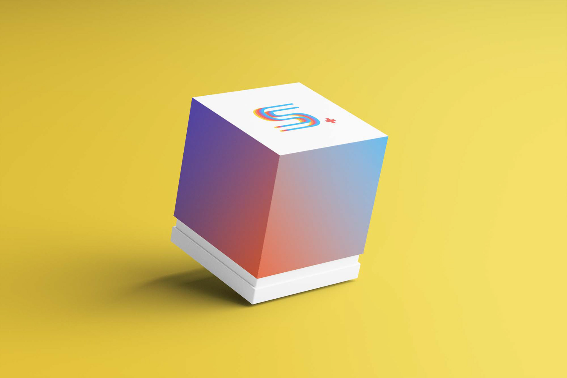
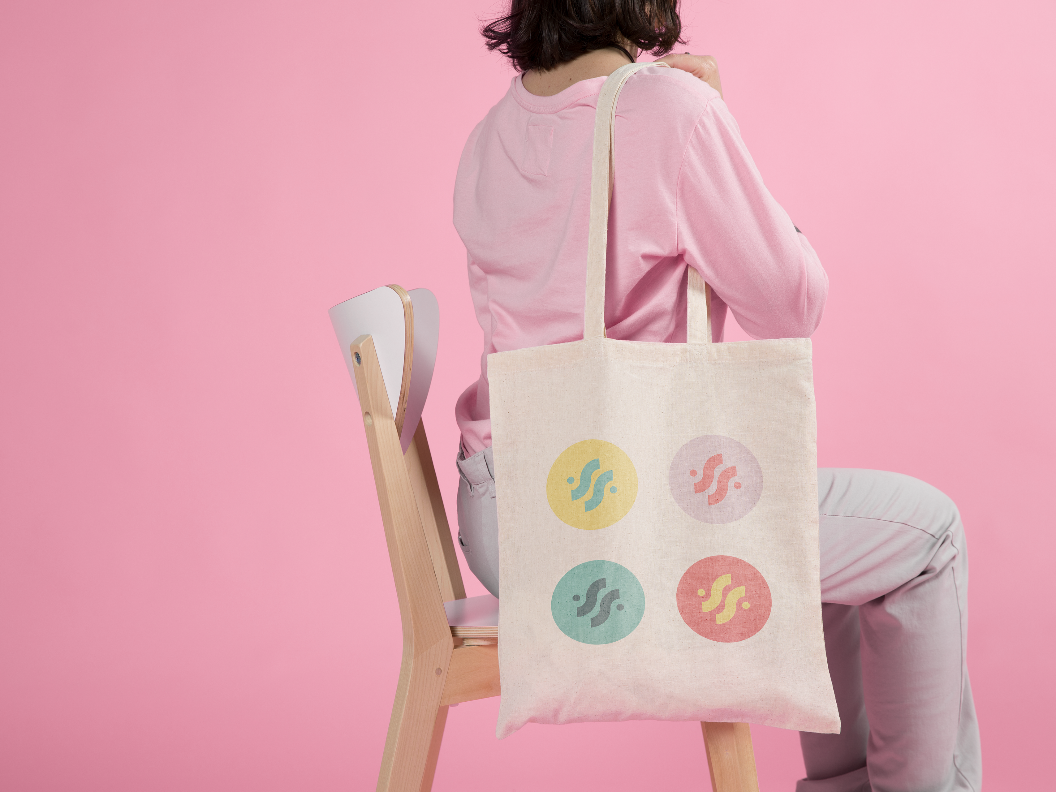
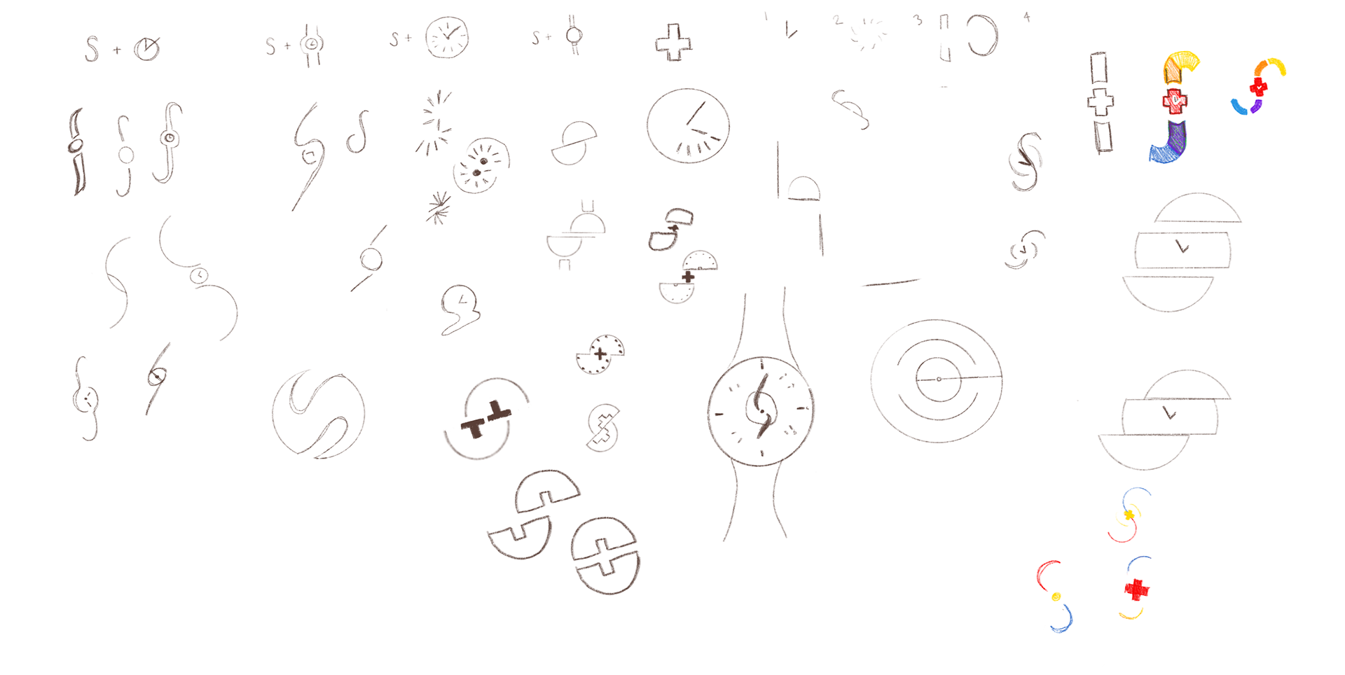
THE MONOGRAM
And from there, iteration after iteration after iteration of testing typeface after typeface, font after font until it finally happened. The swatch monogram is born!


BEHIND THE DESIGN
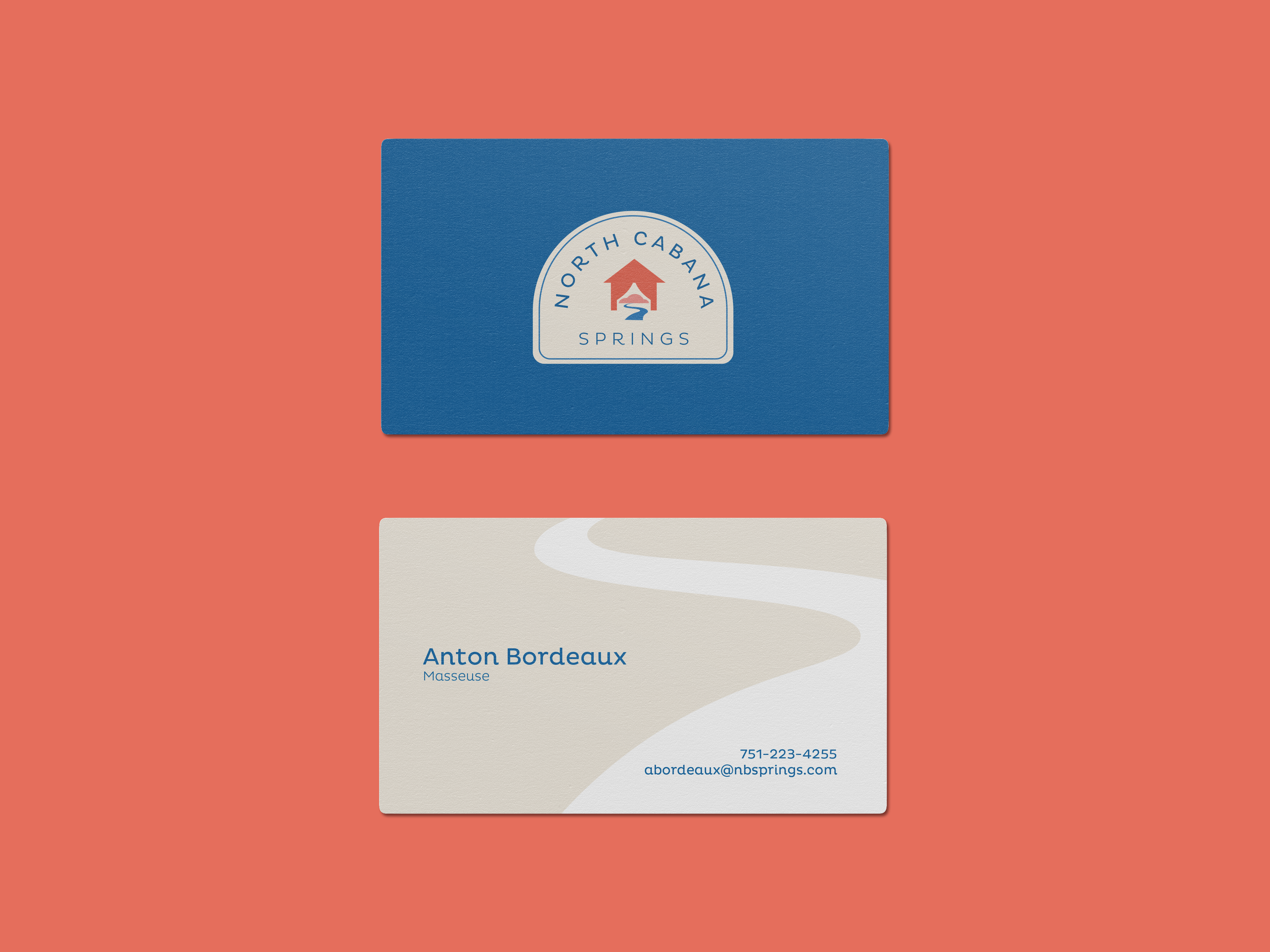
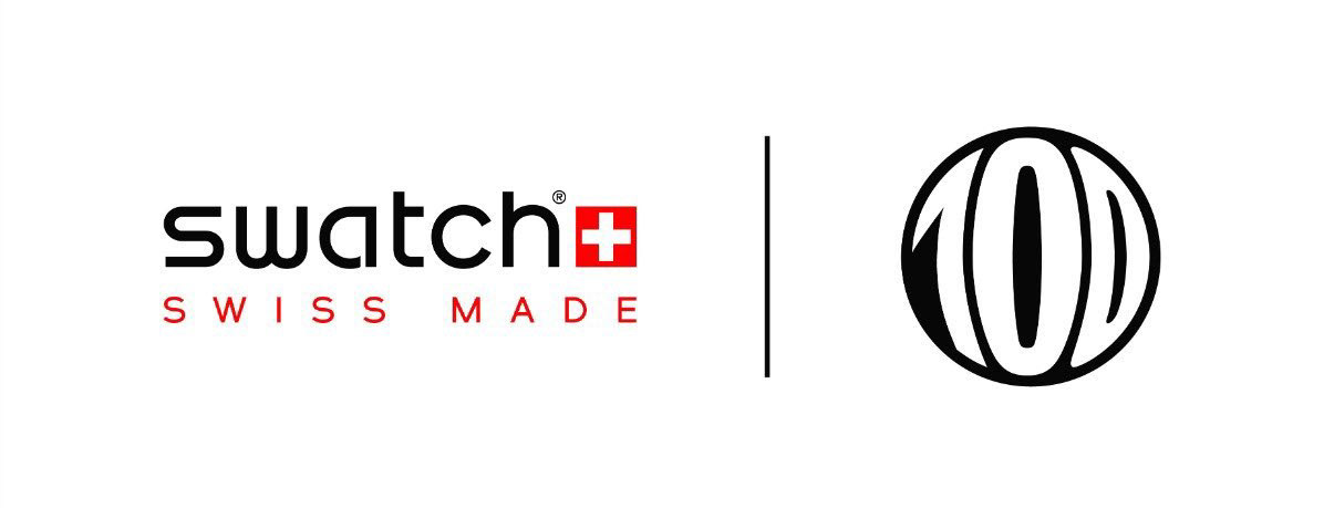
1983. A year of bold colors and venturing into the unknown - the year Swatch was born. When creating this design, I thought: why not bring vibrant colors to the forefront by creating a monogram that is as simple and striking as the Swatch brand? With a futuristic yet simultaneously retro design, this monogram will bring long-time Swatch lovers and new customers alike back to a time of new discoveries. It will inspire them to go beyond their comfort zones and be as bold as they want to be because that’s what Swatch is. The classic red is enveloped by neighboring colors that propel it forward. Rounded edges that allow it to flow and a clean form give it a modern feel that speaks to all ages. The S form can be easily cloned diagonally to create a linked pattern and can also be rotated to create a tile pattern.