Situation
Alexandra Robinson, the founder of Mini Me Productions, is a driven filmmaker with big ideas. She came to me in search of a logo design so she could boost her company's credibility. However, after discussing her goals, the message she wanted to send and what her company's core principles were, we found that a full visual identity would be the right fit to get her set up with the tools she needs to create official documents, merchandise, and overall consistent brand elements.
Initial Ideas
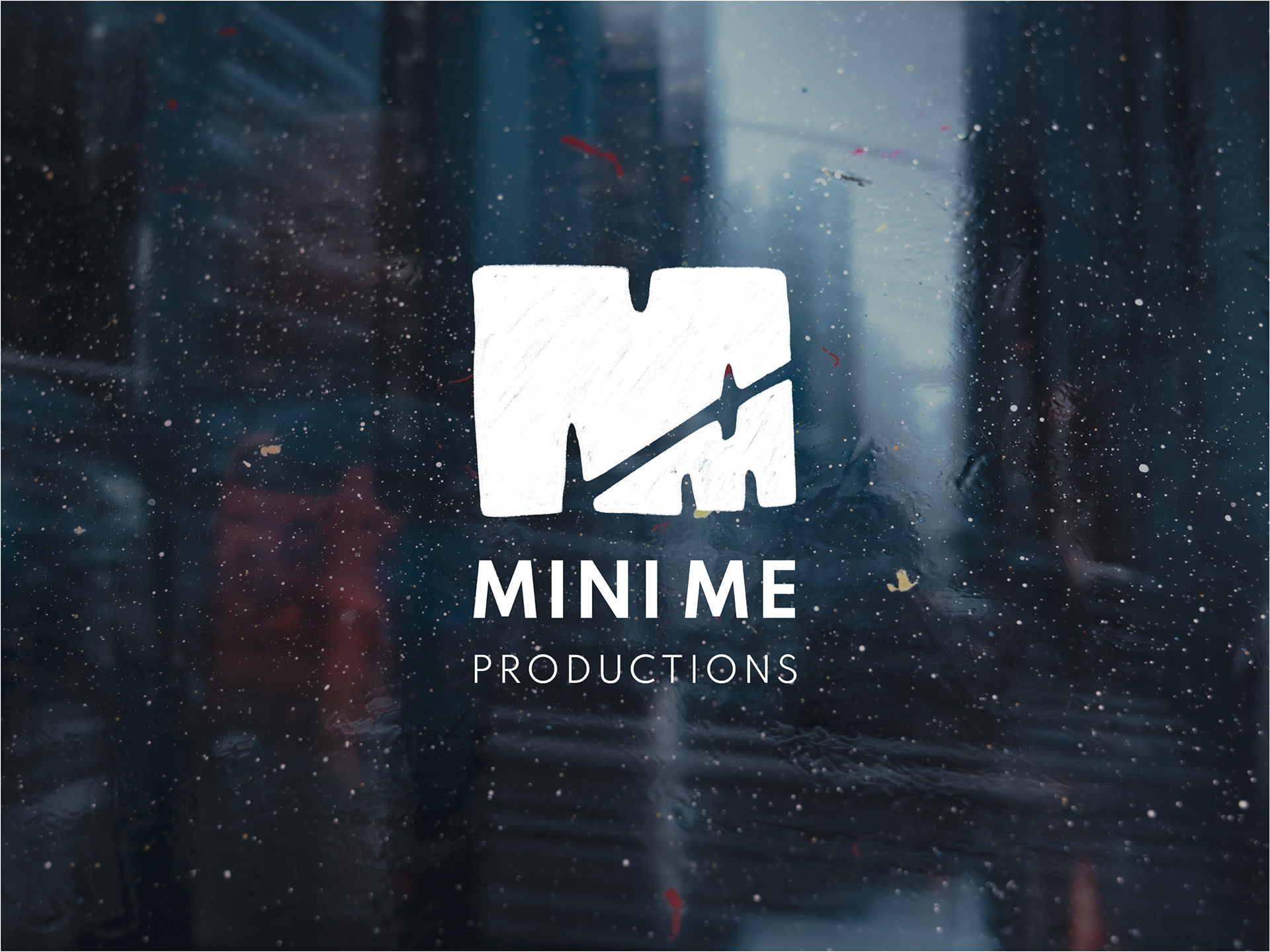
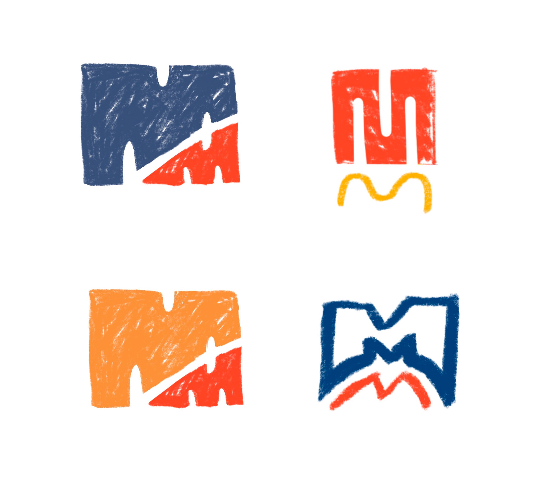
I fleshed out a variety of ideas to get a better idea of what direction she wanted to go in. The core of the company revolves around having a lettermark with one large letter M over a smaller letter M. The larger M symbolizes her late father watching over her, who always called her his "mini me." Much like him, she puts indelible passion and hard work into making her dreams a reality.
With this idea of a loving father supporting his daughter, I leaned into the idea of two bold Ms working in unison to create a strong, recognizable mark.
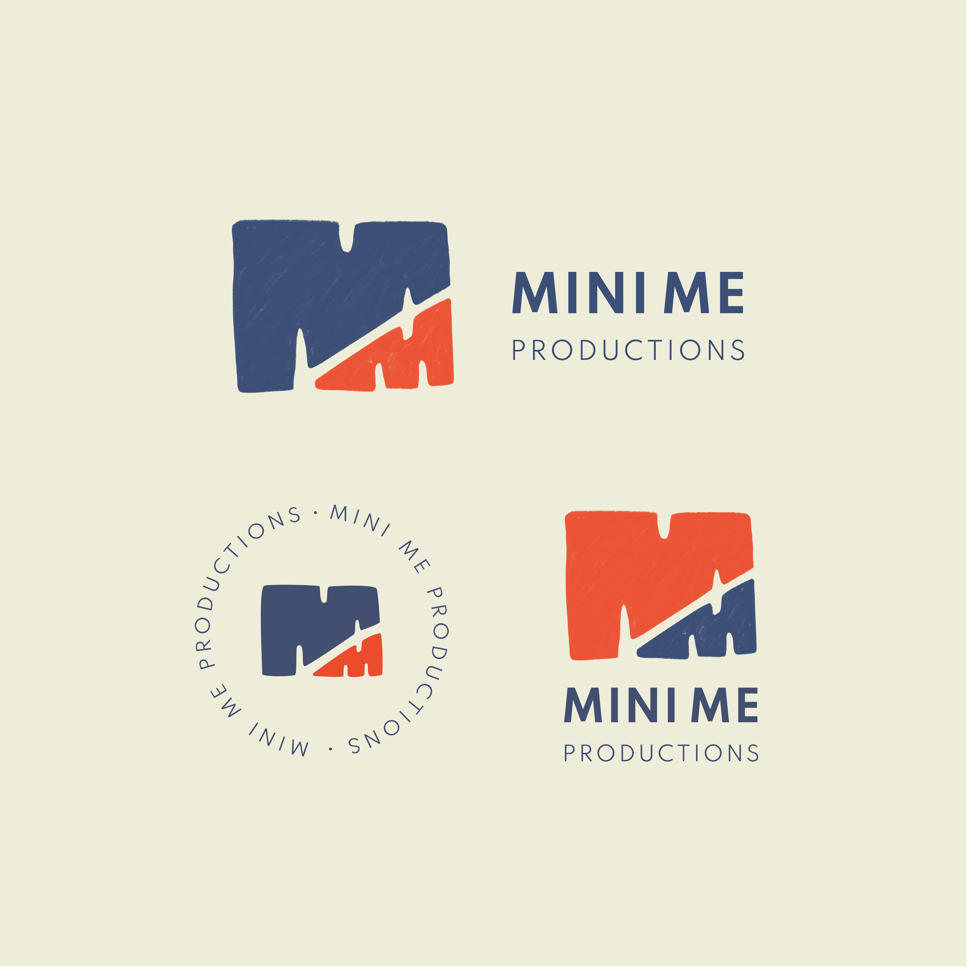
logo variations
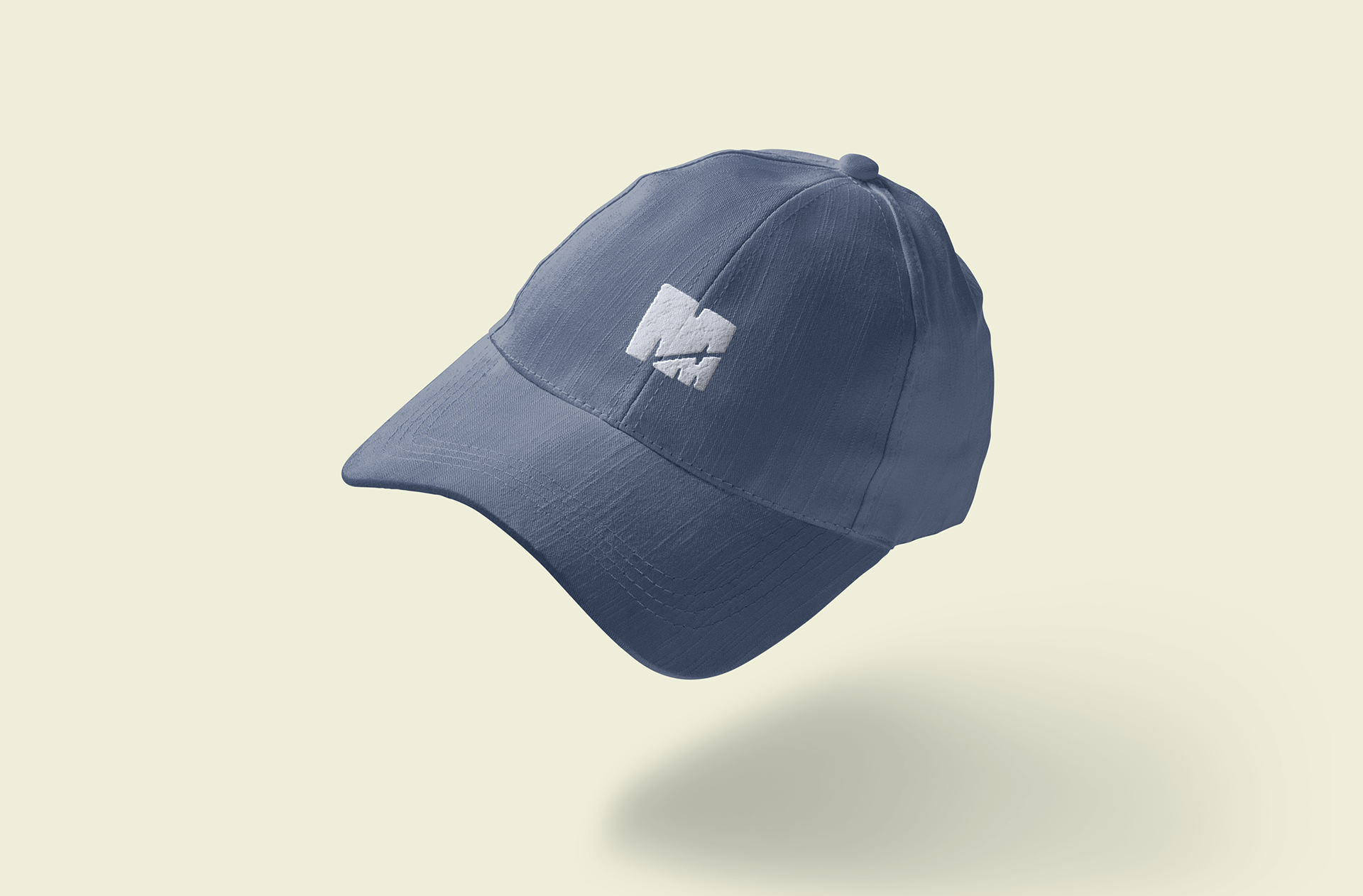
hat mockup
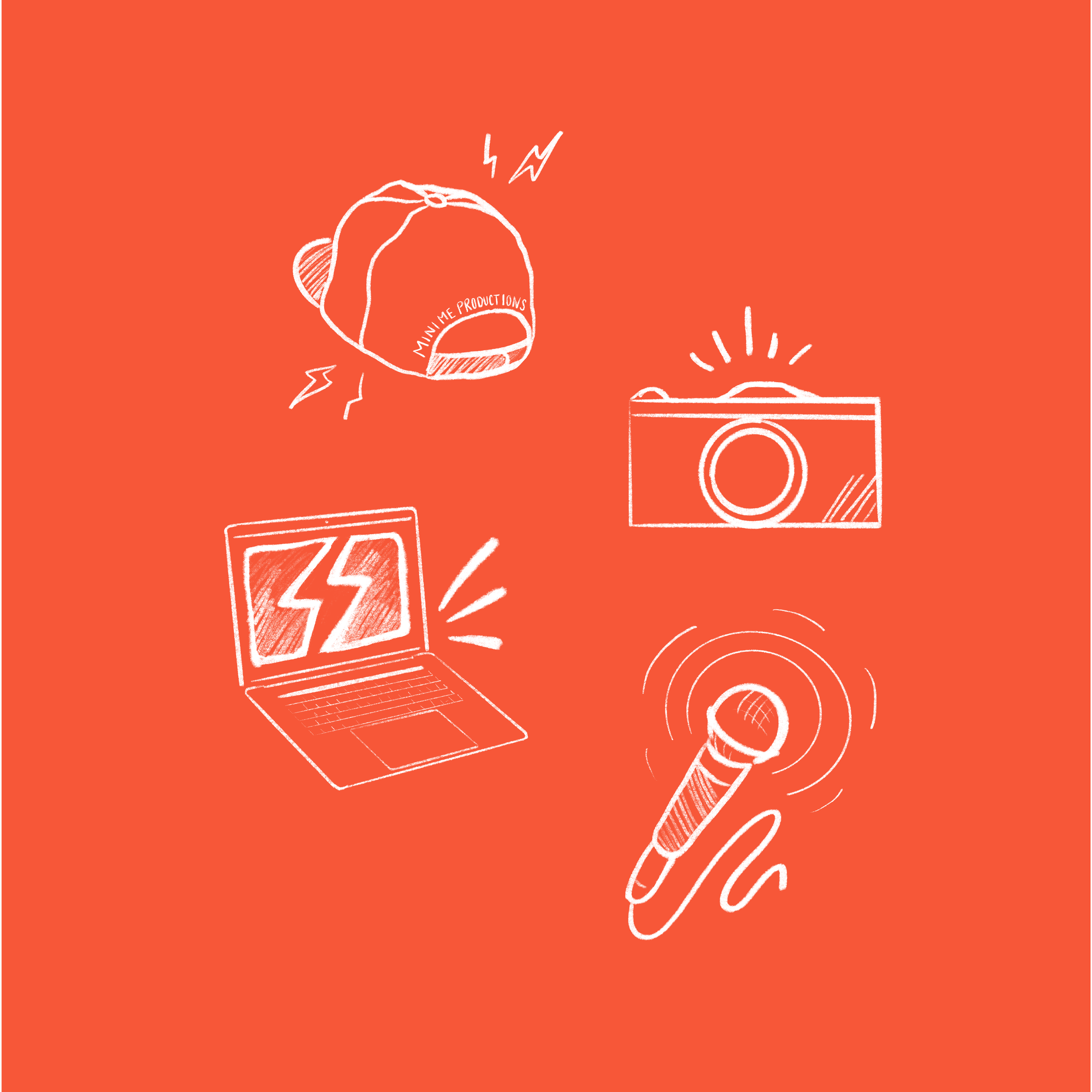
hand drawn illustrations made on Procreate for iPad

animation made on Procreate for iPad
Bringing It All Together
She wanted a vibrant color palette that matched that of her youtube videos and short films along with easily legible, clean typography, logo variations, and illustrations to make the overall identity stand out in her category.
Working with her was an effortless, enjoyable experience and I look forward to our next project.
“I told Gillian a seed of an idea and she was able to cultivate into something beautiful. Her understanding of the given task is one of the reasons she’s such a delight to work with. Talented and kind - you can’t go wrong. I look forward to working with her again.”
- Alexandra Robinson, Founder of Mini Me Productions (https://minimeprod.com/)