The Challenge
When I took on the challenge, I noticed that the diamond-shaped, garnet logo made in Canva (below) and knew a refresh was in order not only to differentiate the organization's brand from the others at FSU, but also to more accurately represent what Social Spear was.
Old Logo
New Logo
Approach
To highlight Social Spear's fun, educational goals, swapped the overused garnet and gold for a bright, happy color palette and geometric custom lettering to introduce a playful, modern, and striking feel.
Additional Submarks
Applications
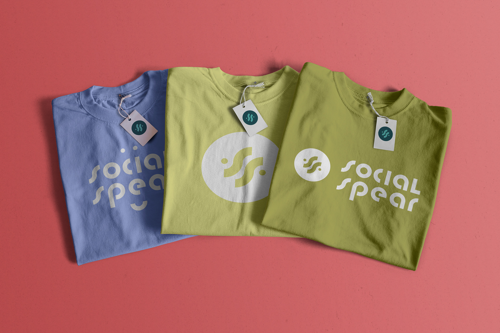
Below are applications on shirts, buttons, totes - all campus organization essentials. More about Social Spear can be found here.
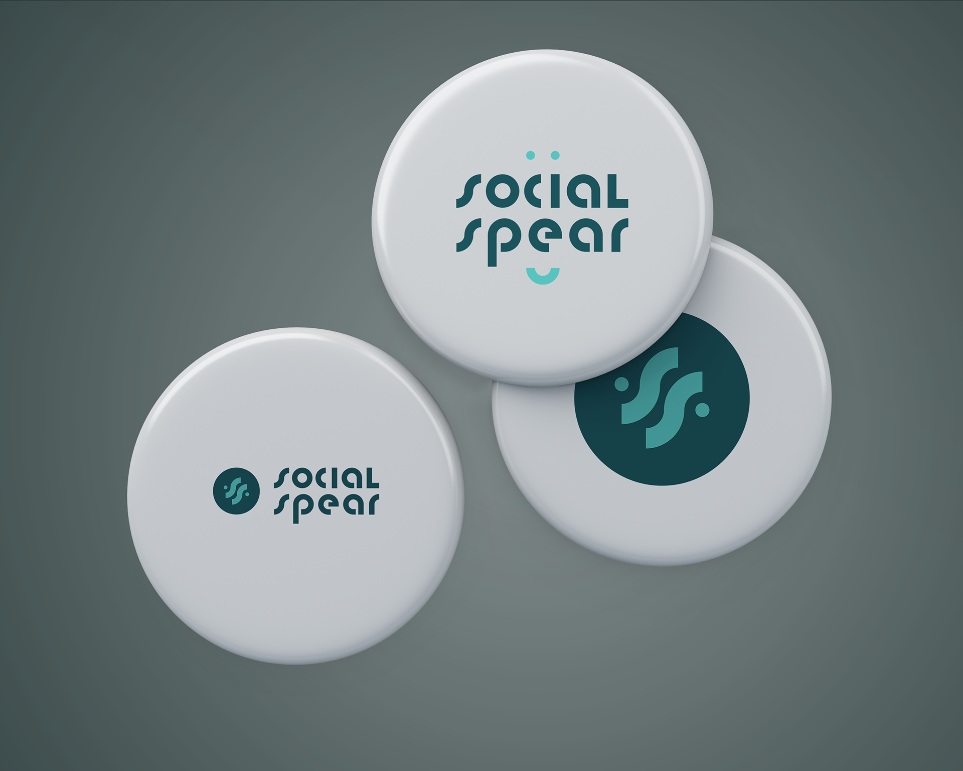
Social Spear Buttons
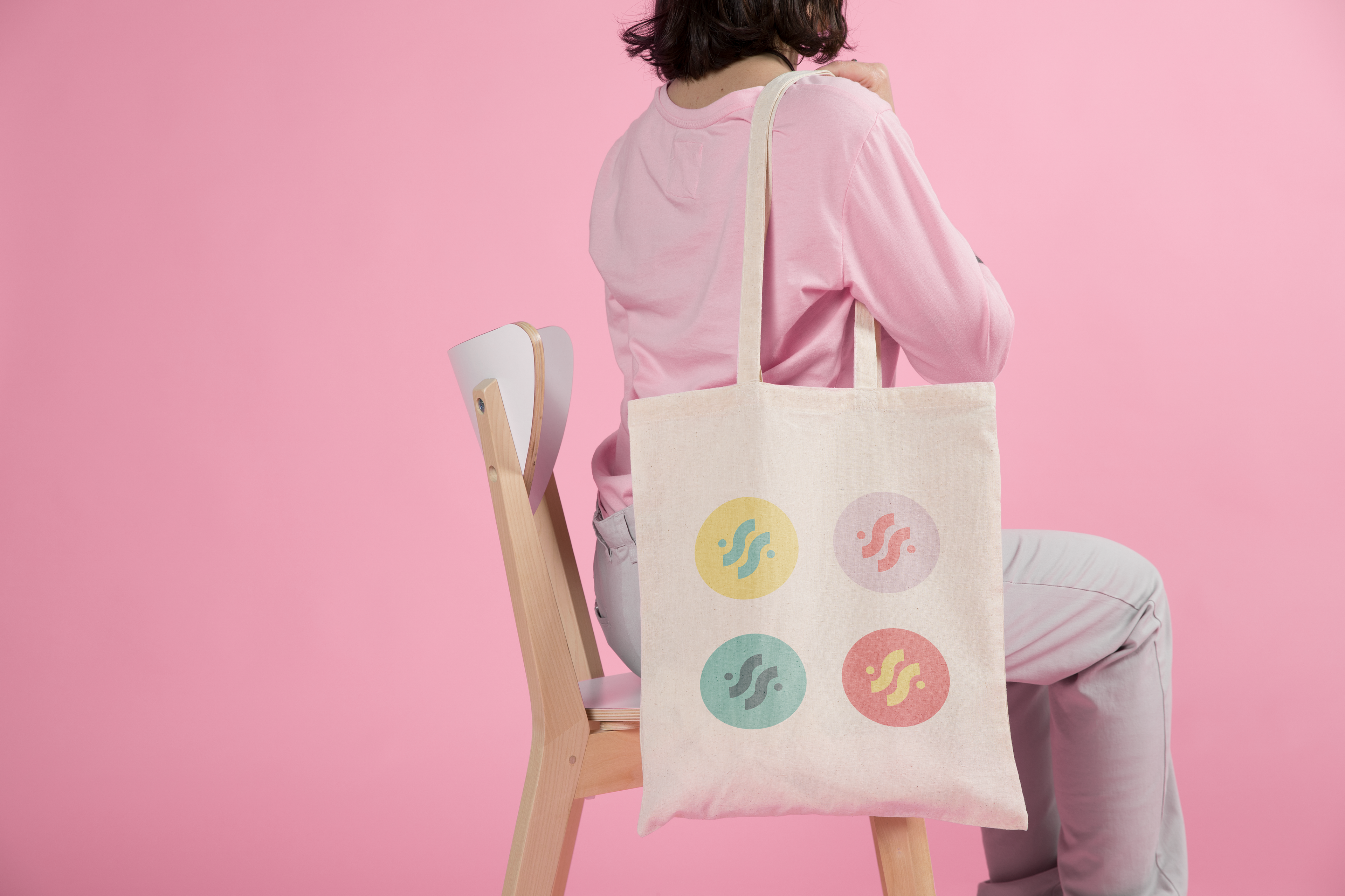
Social Spear Tote
