Humble Beginnings
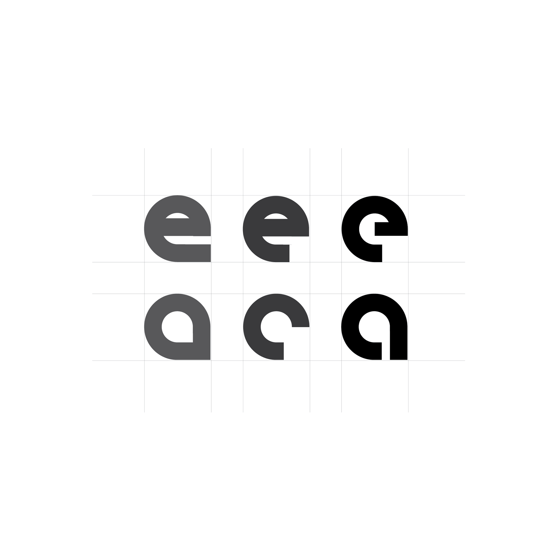
Nailig started with the basics: geometry. I wanted it to feel very modern yet somehow natural, so I played around with different shapes, keeping it as simple as possible. Below is an image showing the evolution of the first letters created for Nailig - the "e" and the "a", which are quintessential to the core of the font.
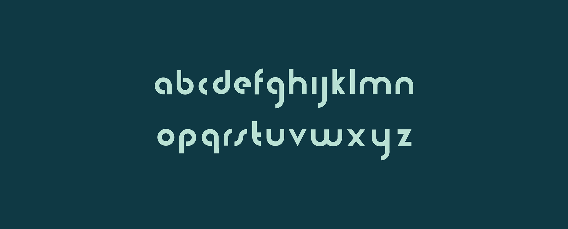
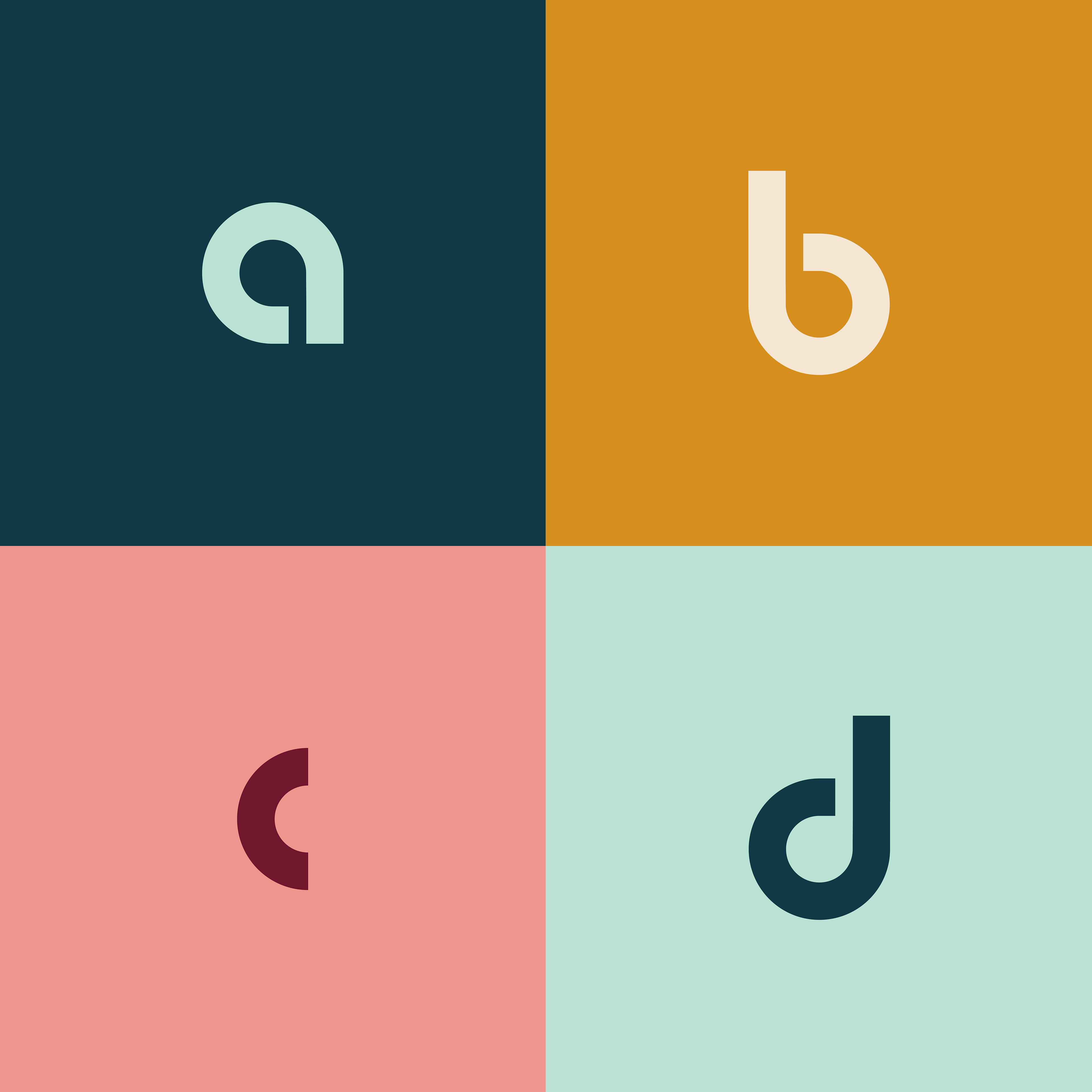
The Final Product
Nailig exudes clean corners and buttery-smooth turns. All at once, an exquisite title font.
To Be Continued...
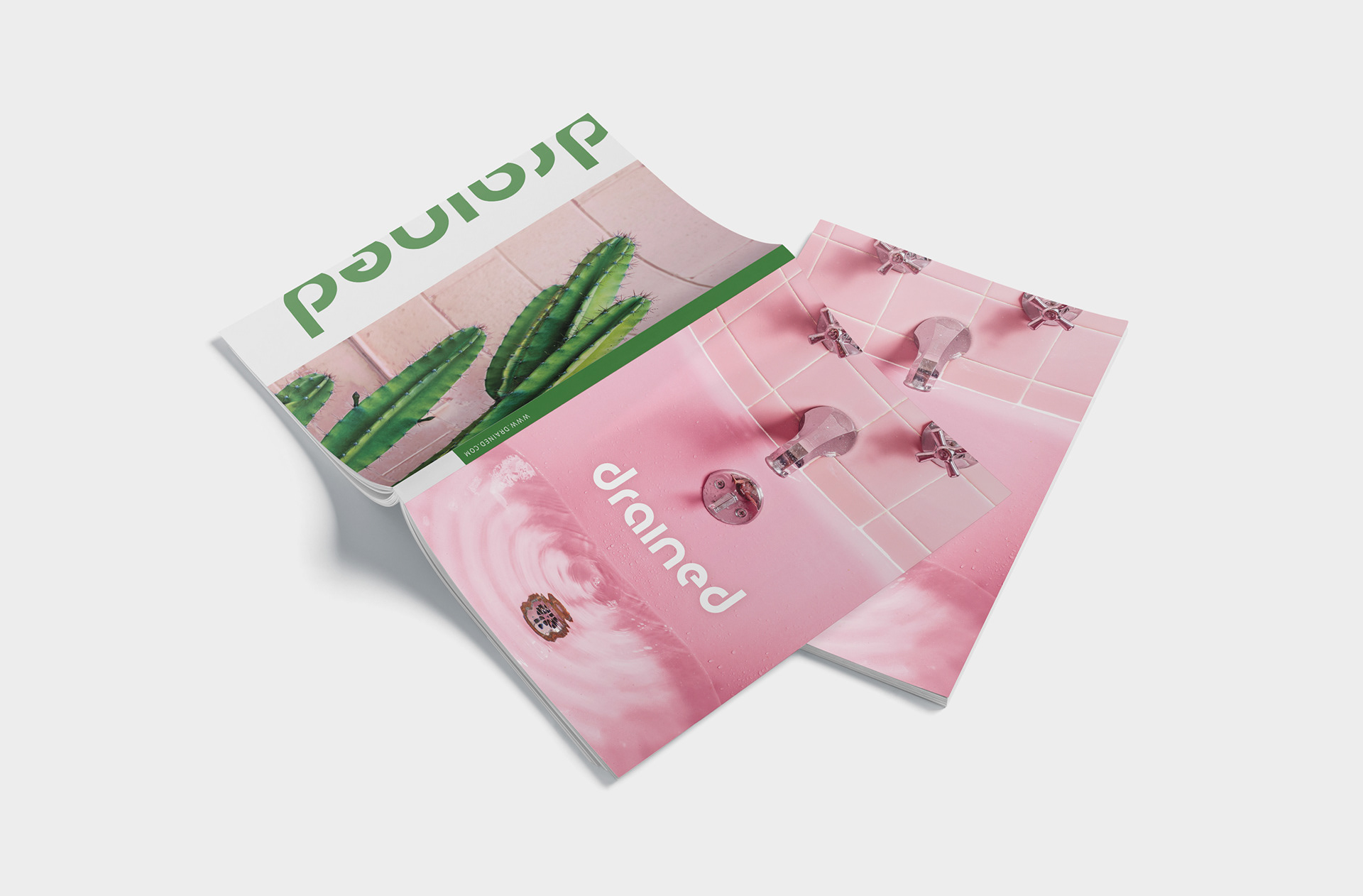
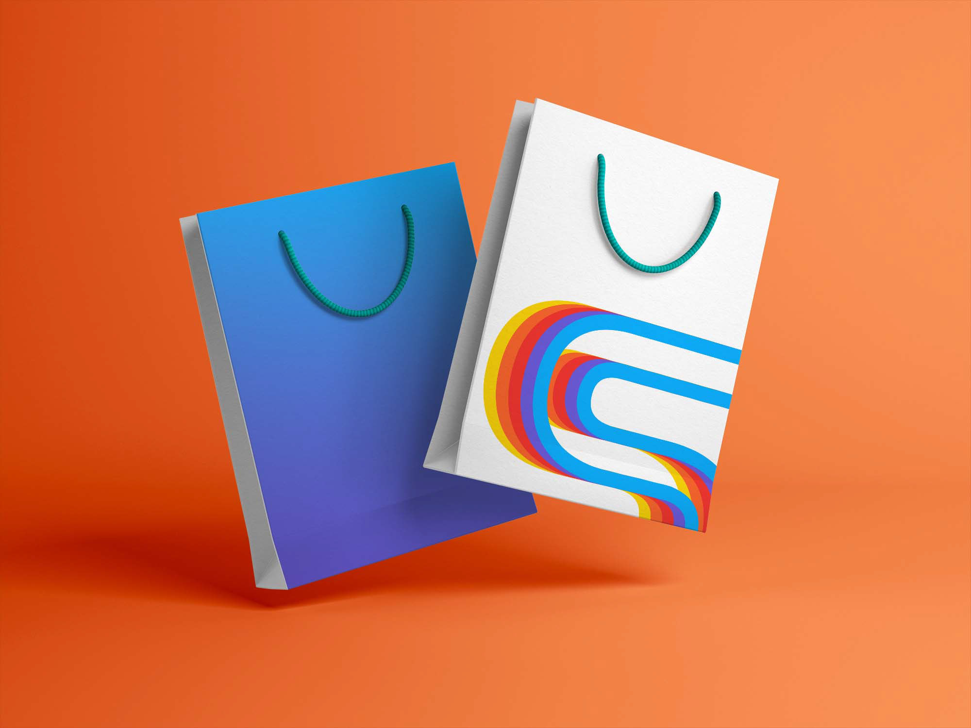
Nailig is not yet an active font that can be used to type with, but it is on the way there. In the meantime, enjoy this mock-up of what it would look like on a magazine cover. (Image credit: Unsplash.com)