Situation
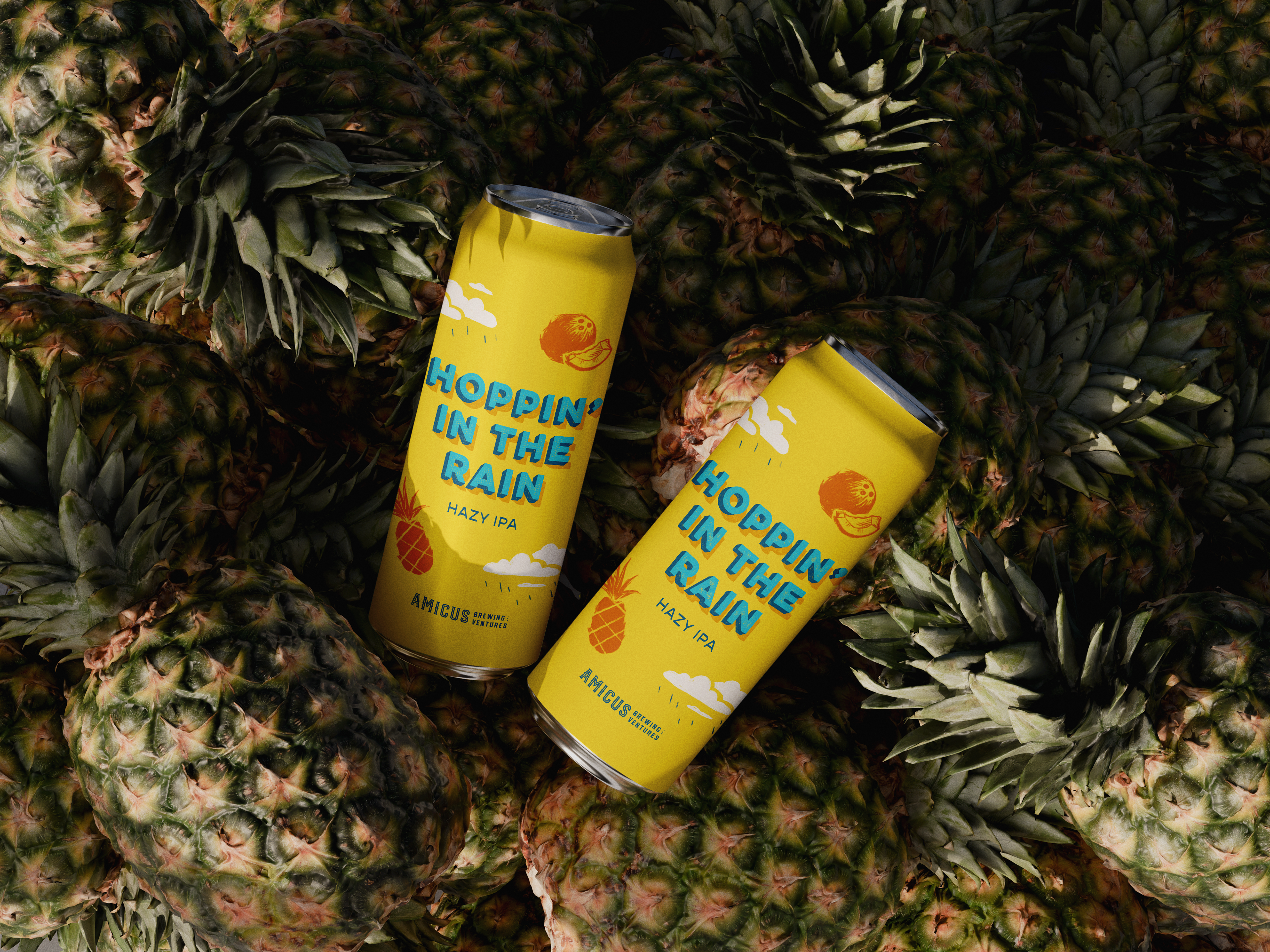
Amicus Brewing Ventures isn't just a brewery; it’s a women-owned staple of downtown Tallahassee, tucked inside the historic Old City Waterworks. They’re known for bold flavors, a welcoming beer garden, and a fun, laid-back environment right next to Cascades Park in the heart of the city. When they approached me to design the label for Hoppin’ In The Rain, I knew the art had to be as fun and refreshing as the pour.
Approach
The beer itself is a total tropical experiment—a Hazy IPA that thinks it’s a Piña Colada. Brewed with Sabro and BRU-1 hops, it’s creamy, milky, and smooth, finishing with that signature hoppy bite. The muse? None other than Rupert Holmes’ classic anthem, "Escape (The Piña Colada Song)."
The goal was to lean into something bright, fun, and a little bit nostalgic.
The Power of Yellow: I chose a saturated, sunny yellow as the primary color. It’s impossible to miss on a shelf and immediately sets the "island time" mood before the can is even cracked open.
Pop-Out Typography: To grab the eye (and keep it), I used a heavy, three-dimensional block font. The 3D effect gives the name a physical presence that feels as substantial as the beer’s creamy mouthfeel.
Illustrations: Simple, clean illustrations of pineapples and coconuts represent the flavor profile without cluttering the layout.
Cloudy with a Chance of Hops: Since the song is all about "getting caught in the rain," I integrated stylized rain clouds, tying the name to the lyrics and adding a whimsical touch to the tropical theme.
Bringing It All Together
The result is a label that feels like a vacation in a can. It strikes that perfect balance: it honors the experimental hop profile for the beer nerds, but uses playful, high-energy visuals to invite everyone else to the party.
Whether you’re in the beer garden at the Waterworks or stuck in a Florida afternoon thunderstorm, Hoppin’ In The Rain looks exactly how it tastes—bright, bold, and a little bit adventurous.